Overview
Avalanche Canada is a public avalanche forecasting organization that produces daily public avalanche bulletins to inform recreationists traveling in mountainous avalanche-prone terrain. These avalanche bulletins communicate the potential risks recreationists face when traveling in the backcountry and what characterizes the nature of current and future avalanche hazards. Avalanche forecasters produce these bulletins using a variety of data sources ranging from daily field reports produced by avalanche professionals, to remote sensing weather stations or weather models produced by Environment Canada. These data sources are disparate, sparse, and heterogenous, leaving forecasters to spend copious amounts of time manually sourcing data from various websites to conduct their analyses.
For the past several years Avalanche Canada has been developing a new software system called AvID, which stands for avalanche information distribution. A component of this software system has been dedicated to bringing the various disparate data that forecasters rely on into one place and visualizing them. We have been collaborating with Avalanche Canada on designing and developing these visualizations.
Our background research with the forecasters identified two areas that were "low hanging fruit" and could create a large impact on avalanche forecasting work. The first of these focused on weather data gathered from remote weather stations in the mountains of British Columbia and Alberta. These weather stations are used on a daily basis to validate the previous day's weather forecast and provide forecasters with situational awareness as the weather changes throughout the workday. The second is focused on field reports of avalanches that were observed. These reports are critical for forecasters because they are the best evidence for current avalanche problems and trends that may inform what may occur in the future.
Impact
The weather visualizations we created over the course of the 2019/2020 winter season were used operationally by forecasters at Avalanche Canada while they were still in the prototype phase. Forecasters reported that these visualizations reduced the amount of time taken to validate their forecasts from up to 2-3 hours to less than 15 minutes. Additionally, they reported having access to weather stations that they normally would never have had the time to incorporate in their analysis. This had the downstream effect of improving the informativeness and specificity of the resulting public avalanche bulletins.
The avalanche observation visualizations have by far been the most challenging to design because of the data used. Reports of avalanche observations follow industry standards that result in structured fields that appear to fit normative assumptions about aggregation used in visualization. However, in the process of creating visualizations that performed simple computations such as counts, the forecasters informed us that we were actually hiding important contextual information. These reports must be read individually and in context, and so we designed visualizations that balanced the ability to see broad scale patterns with the need to read each report as an individual entity. These designs are currently being developed and put into production.
Both these visualizations have formed an integral part of a PhD Thesis.
Visualizations
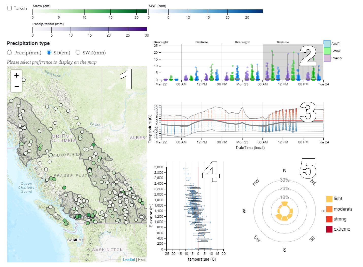
- Here weather stations from a variety of networks are shown as individual dots. Forecast regions are shown as gray transparent polygons. The color of the dots correspond to the snow depth that has accumulated over the selected time span. As there are multiple measures of precipitation, radio buttons above the map are used to switch between measurements from precipitation gauges (Precip), snow depth sensors (SD), and snow pillows (SWE). Stations that do not report the selected data type are shown as transparent circles. Hovering over an individual stations displays that stations' sensor readings over the course of the selected time period
- Precipitation accumulation measures covering 6 hour intervals from weather stations are shown as box plots corresponding to each sensor and data type. The 6-hour interval was chosen based on advice from forecasters under the understanding that this is roughly a good time duration to summarize regional weather patterns and because it corresponds to operational work hours. The various precipitation measures are shown side-by side to also support analyses that can estimate the relative moisture content of the snow
- Weather stations provide temperature readings at every hour. Here, every circle represents a station-hour reading. The center line shows the median temperature across the selected weather stations. Upper and lower line show the max and min temperature values.
- The y-axis in this visualization corresponds to elevations, while the x-axis represents temperatures. Each line represents a weather station. The width of each line spans the range of temperatures that occurred at that weather stations for the selected time range (visualization 2). Dots on each line mark the max, min, and median temperatures for each station. 0 Celsius is marked by a red line to allow for easy identification of freezing levels.
- Wind speeds are binned according significant thresholds for avalanche forecasting (such as the transport of snow through wind). The radial distance from the center corresponds to the % of time that the wind was blowing at a particular speed in a particular direction across all selected weather stations. This is an aggregation of all weather stations. Times when wind was < 1km/hr are below threshold of light wind and are counted as no wind.
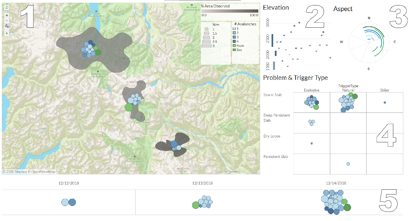
- Here the gray polygons represent avalanche safety operations where reports are sourced from. The clusters of avalanche observations are aligned with the center of the polygon. Often there are no additional geographic data associated with avalanche observations beyond the operation that reported them. If there are specific locations, the circle that would be “attracted” to that geographic location. An algorithm that ensures that circles do not overlap may push circles away from their real locations, but as the map is zoomed in, these resolve to their respective geographic locations.
- Here the y-axis represents elevations while the x-axis is simply a count of reports such that each report takes up a single vertical column in the chart to evenly space the reports. Often reports provide non-uniform ranges of elevations. These present challenges for numerical aggregations. Instead, the data as it exists in the report is presented here. Emergent clusters at certain elevations can be seen.
- Similarly, non-uniform ranges for aspects present challenges for aggregation. Here arcs wrapping around a “rose-style” visualization represent reports and ranges of cardinal directions. Again, radial distance from the center is simply an index for each report.
- Here avalanche reports are presented according their characteristic attributes. A tooltip interaction further breaks down avalanches according to trigger type sub-classes.
- Here, Every day is shown separately with an avalanche observation cluster.
Simon Fraser University provides tools, training and expertise to unlock the potential of big data.
find out more