Overview
VIVA and the SFU Big Data partnered with Miriam Rosin who is the Director of the BC Oral Cancer Prevention Program at SFU and a Senior Research Scientist at the BC Cancer Agency. This project focuses on a longitudinal dataset of oral cancer patients spanning 20+ years and over 300 patients. To date, research has focused on conventional statistical analyses such surival rates and kapplan meier curves. These analyses have had a worldwide impact on triage and treatment protocols for oral cancer professionals around the world. However, much of clinical decision-making is largely led by the intuition and best judgement of clinicians. Our collaboration is exploring new perspectives of this data to shed light on what may be informing clinical decision making practices and how that may relate to changes occuring in the underlying pathology. We are exploring visual analytics techniques that consider temporality, sequences, co-occurences and proportions in the data. These new perspectives have the potential to challenge commonly held assumptions and rules of thumb used by clinicians and inform future research diretions to better understand the pathology and inform clinical practices.
Impact
Visualizations from our collaborations were presented at the 2018 European Association of Oral Medicine conference and stimulated dialouge about bringing oral care practitioners closer together with oral cancer researchers. Our work was also due to be presented at the 2020 Global Oral Cancer Forum, but this presentation has been postponed due to COVID-19.
Proportions across Patients and Visits
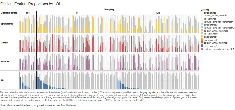
At the start of our collaboration the focus was on exploring and communicating insights that were already established through statistical analyses. This analysis dealt largely with proportions of both patietnts who displayed certain clinical test results as well as the relative proportions of their total visits that resulted in those test results. In the figure above, each vertical column corresponds to an individual patient. The layout of the visualization is segmented into rows by the type of clinical test. The coloured bars represent proportions of total visits that tested positive (colored), negative (gray), or were not tested (white) within each patient. At a higher level, patients can be grouped by whether they progressed to cancer or which genetic risk category they belong (shown above as LR, MR, and HR). Grouping and sorting this visualization allows comparisons and pattern detection at multiple levels. Relative proportions of patients showing a certain clinical test result, how frequently across their follow-up period they displayed this clinical test result, and whether this coincided with similar proportions of test results in other clinical tests.
Sequences and Temporal Changes
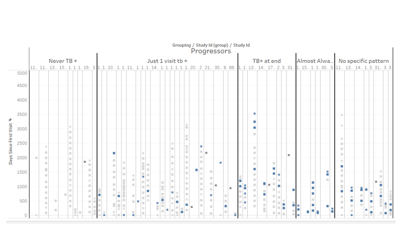
To date, researchers have not utilized temporal or sequential attributes of longitunial data of follow-ups in oral cancer patients. This has largely been due to small sample sizes. Visualizations allow researchers to identify emergent patterns informed by their understanding of oral cancer pathology as well as the practices of clinicians that may influence the data. In the visualization above, we explored a clinical test called "Toluidine Blue" which is considered a gold standard for identifying potential progression. Again, in the visualization above, each patient is shown as a vertical column. Each square is a visit and the color corresponds to the Toluidine Blue test results. The vertical axis shows time elapsed since the first patient visit. This shows both sequence and temporal aspects of the data. Using a qualitative approach, sequences showing similar patterns were grouped together guided by the expert knowledge of Dr. Rosin. This approach revealed that there was a pattern that was present in non-progressing patients while absent in progressing patients.
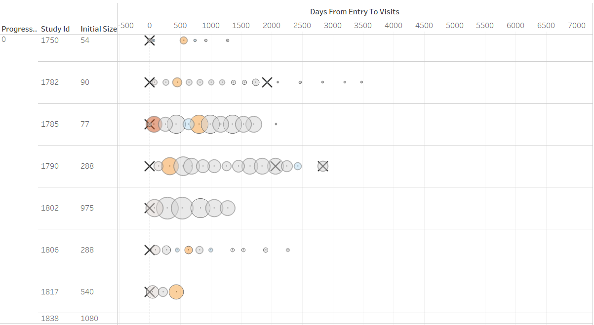
We also investigated lesion sizes and size changes. This is also seen as a critical indicator of risk of progression. How size changes are treated and interpreted is not formalized and decision-making is largely driven by expert judgement of the clinician. Given the wide range of lesion sizes and frequent biopsies which may impact the size change behaviour of a lesion, investigating such pattern proved challenging. We adopted a threshold rate for size changes which is conventionally used to determine meaningful size changes in clinical drug tests. This is a change of 50% or greater in the course of time clinical trials are usually carried out (usually 6-12 months). This allowed us to highlight significant and meaningful size changes in the data. In the visualization above patients are shown as rows. Circles are visits. The size of the circle corresponds to the absolute size of the lesion, while the color corresponds to bins of percentage change above 50%. The X's correspond to biopsies. This allows researchers to gain a naturalistic perspective of lesion size changes. This visual metaphor has proven useful and intuitive. We have been exploring other measures of size changes that may be indicative at the aggregate level such as measures of volatility in size changes which may be indicative of biological processes underlying the evolution of the disease.
Co-occurences
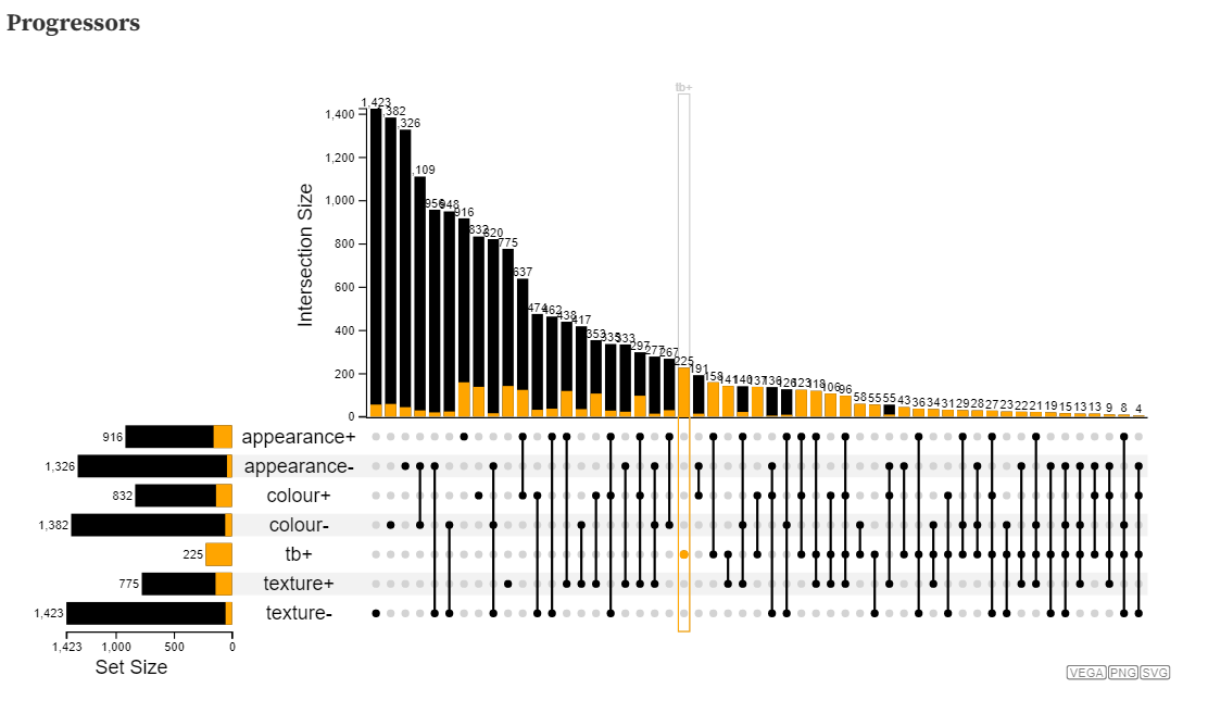
Clinical tests address different aspects of lesion behaviour and are viewed holistically and in tandem throughout the clinical care. To replicate this perspective, in this investigation we are looking at the co-occurrences of clinical tests that may meaningfully reveal new information about the disease at an aggregate level. As a first step we are using visualizations developed through the lens of set theory. The visualization below is an adaptation from a popular visualization technique and package called UpSet. Instead of traditional approaches for displaying sets and intersections such as euler diagrams or venn diagrams, this visualization takes the approach of using a rectilinear layout to display the sets on the y-axis (in this case clinical test results that are either positive or negative) and intersections using linked lines and nodes with the sizes of intersections shown above as a bar. In this visualization, each visit is an individual data entity and is used as the basis for calculating set intersections. These intersections are not exclusive, so hovering over any intersection shows the frequency and proportion of that particular intersection occurring in other intersections and sets. That is “how many times did this combination of test results occur in other combinations?” and “how many times did this combination of test results occur in combination with any specific clinical test result?”. While visualization has provided an interesting perspective, it did not allow for easy comparisons between patient groups such as progressors or non-progressors (the visualization below just shows progressors).
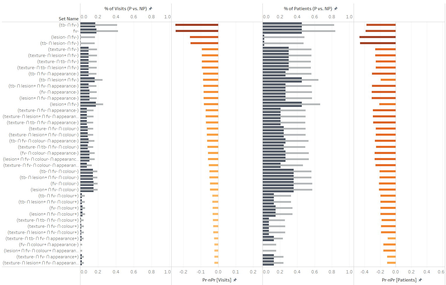
We expanded this the perspective that Upset provided by exporting data about set interesctions and using it to make comparisons between progressing and non progressing groups. Large differences between progressors and non-progressors could be useful indicators of risk. In the visualization above this is the approach we took. We calculated the proportions of total visits that any intersection of test results occurred within both progressors and non-progressors. We also calculated the proportion of total patients in which an intersection ever occurred. The former measure considers the propensity for certain co-occurrences in either patient group, while the latter measure considers how unique any co-occurrence may be to a patient group. We calculated disparities between progressors and non-progressors to sorts intersections (co-occurrences) that may have more or less negative or positive predictive power. We only investigate set combinations that are meaningfully related and answer specific questions, so that they may be less prone to spurious patterns. For example: “Do any visible attributes of lesions (appearance, color, texture) in combination with TB+ improve the predictive power of TB+?”, “Are there any large differences in the frequencies with which co-occurences of visible attributes of lesions negatively or positively predict outcome?”, “Do any clinical tests improve the negative predictive power of Fluorescent Violet?” etc. In the visualization above, various intersections are shown as rows. In the first column titled “%of visits (P vs. NP)”, proportions of total visits within progressors (dark blue) and within non-progressors (gray) are shown in a bullet chart. The next column shows the difference of those two values. The columns titled “% of patients (P vs. NP)”, proportions of all patients are compared instead. Again, the final fourth column shows the disparity between progressors and non-progressors in terms of proportions of patients. Set intersections are sorted using the disparity between proportions of visits to explore the negative predictive power of any clinical test result in combination with Flourescent Violet (FV) negative, and to determine if there are any improvements beyond just FV-.
Simon Fraser University provides tools, training and expertise to unlock the potential of big data.
find out more